Crafting a Modern Art Deco Brand Redesign for the Local Women-owned Baltimore Website Design Studio Drio

Meet Hazel and Rachel
Hazel Geary and Rachel McFadden are the dynamite duo at Drio, making your brand the obvious choice. Hazel is a wife, mom of three, and tennis lover. Rachel is also a wife and mom of three, cyclist, runner, yogi, and beer aficionado.
Rachel is the Web Designer + Developer who has helped build roads in Baltimore, Maryland, while Hazel is a marketing strategist who has worked with multimillion-dollar brands, including Under Armour and McCormick. Together, they have designed websites and created digital marketing strategies since 2011. Of course, they didn't stop there and also founded the Monument Women’s Creative Alliance.
Cheltenham provided them with a brand refresh, including new logos and a fresh, custom-designed website.
Industry:
Advertising + Marketing
Project Timeline: 7 months
Deliverables:
Research and Discovery
Brand Identity Design
Website Design


About the Brand
Drio is a Baltimore-based, relationship-focused website design and digital marketing company that has successfully worked with small and local businesses to help make their brand the obvious choice.
Project Approach
Research & Discovery
Cheltenham’s brand development process is designed to help clients understand their brand values, audience, and ideal brand experience. Drio took part in our Brand Clarity Workshop where we explored foundational questions and discovered rich answers about the values of Drio and its ideal aesthetic. Our goal was to design a brand identity system and website that was warm and approachable with a modern art deco aesthetic that allowed Drio to attract the clients they align with.
Design
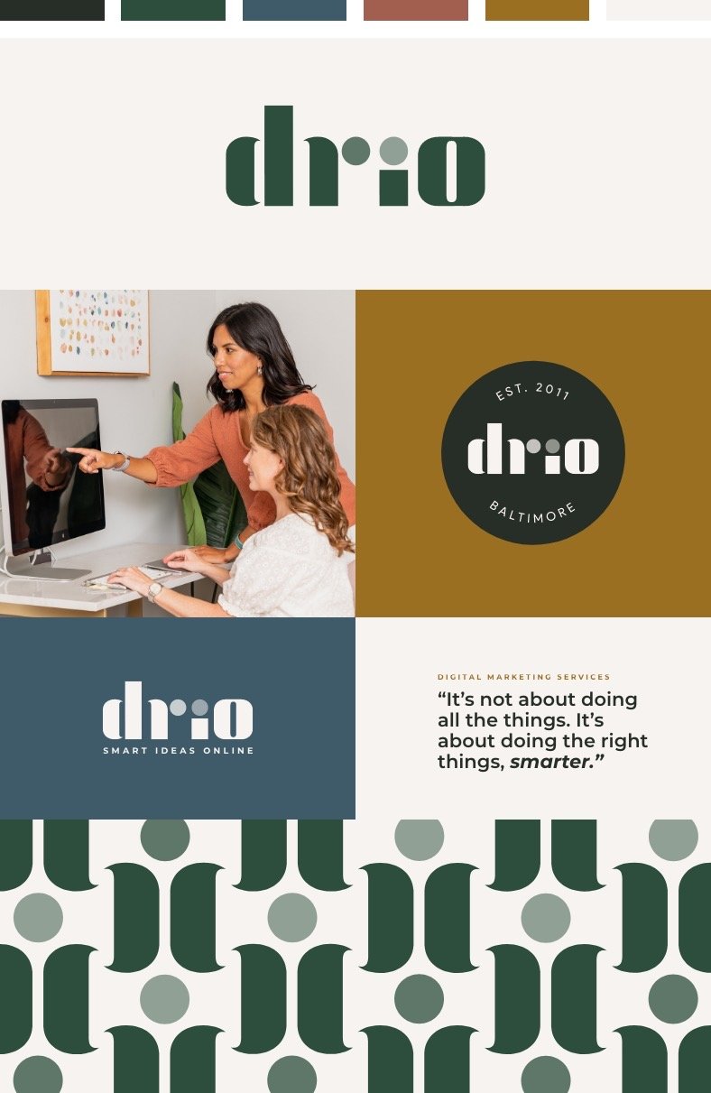
After collecting the foundational information we crafted an inspired first draft of the new brand identity. We designed a new primary logo and variations through multiple iterations, a brand color palette, and a font combination that delivered a refined, modern art deco brand identity.
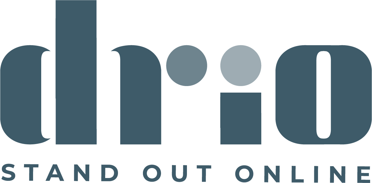
The new logo consists of bold graphical letter shapes. The playful curves on the bowl of the d and the stem of the r create a soft flow, moving the viewer’s eye across the logo. Even with bold letter shapes, there is movement and warmth.
We collected and packaged the specifics of the brand assets into a brand standards manual, design system, and digital brand kit to keep the band guidelines clear, organized, and easily accessible by the client, designers, or developers.
Development
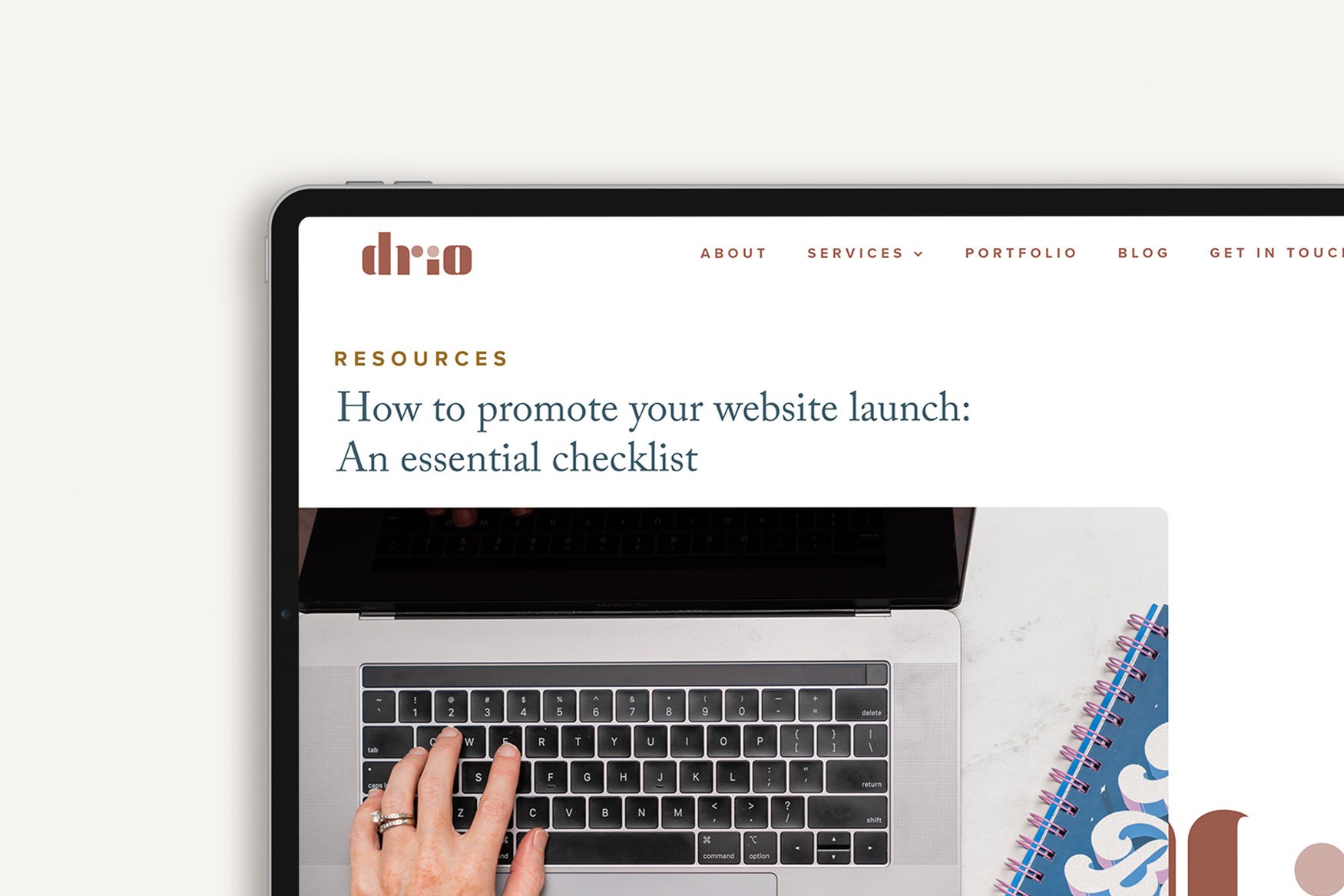
Using Drio’s refreshed brand identity we designed new brand assets and a new website. One of our favorite touches is the subtle animation of the I letter shape near the blog section on the homepage and how it scrolls with the screen on a laptop view. The final brand redesign is fresh with a mature youthfulness, classic yet casual, refined, and rejuvenated.